Marketing journey editor
Journey-building tools for campaign teams at a global social media platform: build a journey as a flow or as data, and QA it before launch.
Try the interactive prototype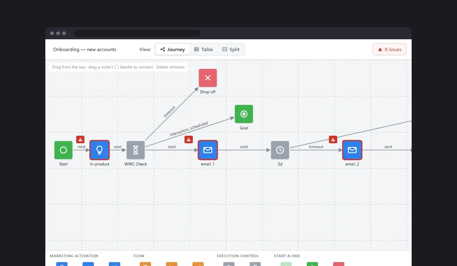
- Project role
- Senior UX Designer (contract)
- Team
- Solo designer
- Timeline
- 8 months, 2022–2023
- Platform
- Desktop web app
- Status
- Shipped
- 3 days → 8 hoursto build and QA a journey
My part in this
- Decision I influenced
- A split map-and-table view, so marketing teams could see and optimize their journeys on their own, faster.
- What I pushed back on
- Working only through subject matter experts. I pushed for developers and real users from day one, and it proved right: the company already had a similar tool we could have built on.
- Trade-off I made
- The journey system ran across slow subsystems owned elsewhere in the company. Rebuilding them was out of scope, so I optimized my part and designed around their limits.
- What I noticed
- Marketers think about a journey as a flow and as data. A data-only tool would shut out visual users, so a split view let each person work their way.
- What changed because I was there
- As the only designer, I took building and QA-ing a journey from 3 days to 8 hours.
The problem
Campaign teams at a global social media platform build marketing journeys: the emails, waits and branches a customer moves through. The existing tool was a journey map plus 4 disconnected pages that took hours, sometimes a full day, to fill in and work from. Checking the data (are all 11 emails tagged correctly?) meant opening every node one by one. Building and QA-ing a single journey took days.
The journey system also ran across slow subsystems owned elsewhere in the company. Rebuilding them was out of scope, so I optimized my part and designed around their limits.
What I did
Key insight Marketers think about a journey in two ways: as a flow (“what happens next?”) and as data (“is every email tagged right?”). The tool only supported the first, so the second was all manual work.
- 01
Two views, one goal
I gave the map and a data table equal footing, plus a Split view that stacks them. Selecting a node in one highlights it in the other, and validation shows in both: a red badge on the node and a red underline on the exact cell.
Trade-off: Two views means two surfaces to design, build and keep in sync. I accepted that cost because QA from the map alone meant opening every node.
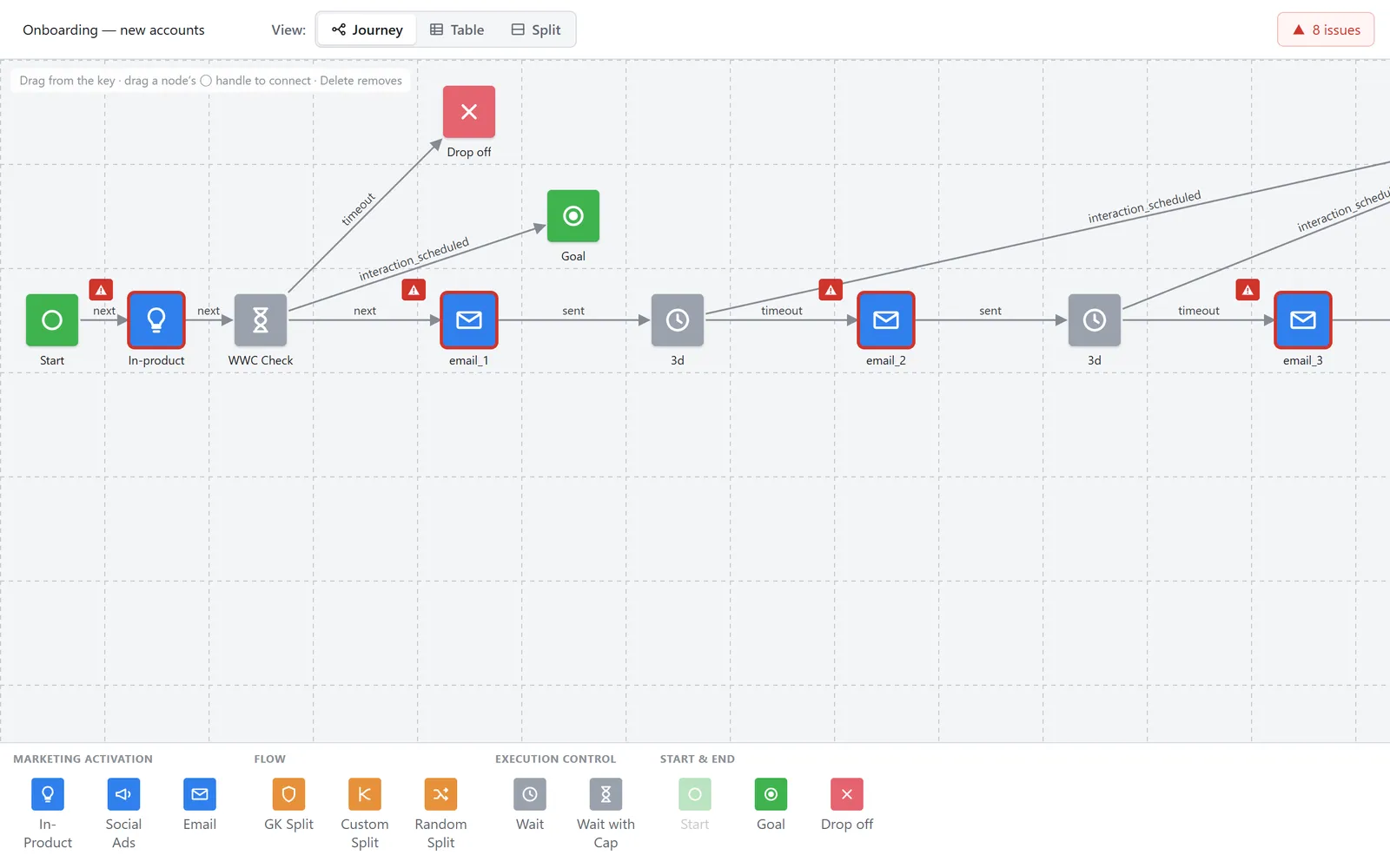
Journey view: issues are flagged on the nodes before launch. 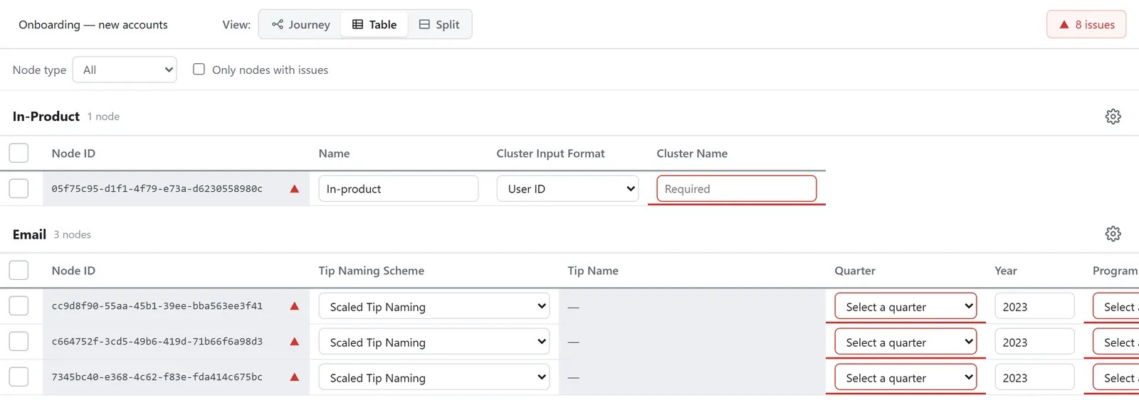
Table view: the same issues are underlined on the exact cells. 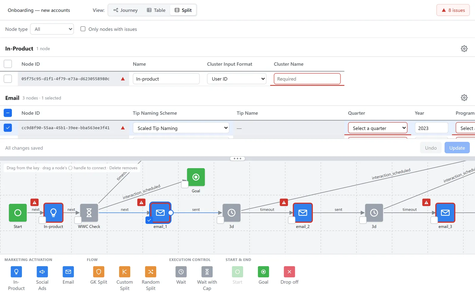
Split view: selecting a node in one highlights it in the other. - 02
Bulk edit that locks unique fields
Select several rows, edit a shared field like Quarter once, and it applies to all of them. Fields unique to a node, like links and CMS IDs, lock while more than one row is selected.
Trade-off: Locking fields is less flexible for power users. It also means a bulk edit can never overwrite one node’s link or CMS ID with another’s, which was the more expensive mistake.
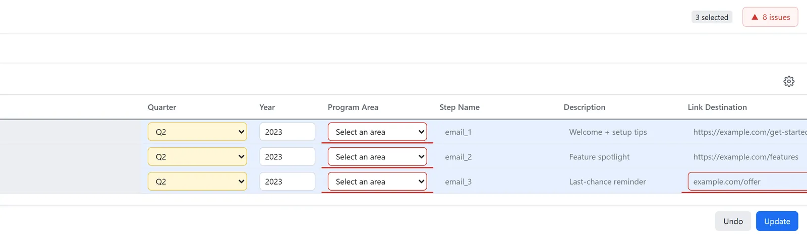
Quarter changed once for three rows. Unique fields like the link stay locked. - 03
Stage, then commit
Edits are highlighted and staged instead of saved instantly. Undo discards the batch, and Update commits it in one write, matching how the journey service actually saves.
Trade-off: Unsaved work is at risk if someone walks away before committing. Highlighting every staged edit keeps that visible, and the single commit gives reviewers a clear checkpoint.
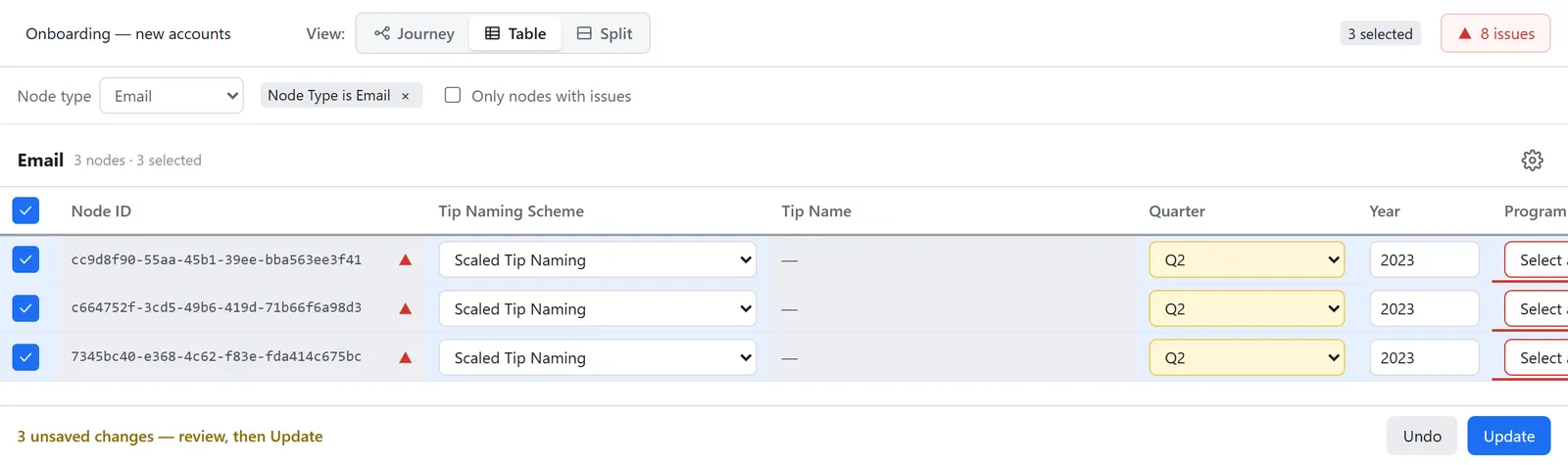
Edits are staged and highlighted until Update commits them in one write.
Results
- Building and QA-ing a journey went from 3 days to 8 hours.
What I’d do differently
Get developers and real users involved on day one. I asked for both from the start, but the client preferred to work through subject matter experts a few steps removed from the work, and that distance cost the project time. It turned out the company already had a similar tool we could have built on, to save time and make the experience even better.
Next time I’d push harder and earlier for that access, and put the cost of going without it in front of leadership before the timeline slips, not after.